
The ever-changing field of finance is replete with complicated methods and techniques that might be intimidating to the regular investor. Golden Cross is one such strategy that has gained prominence in recent years due to its ability to forecast possible purchase signals in trading. But what exactly are the Golden Cross trading strategies, and how can they assist investors in making informed portfolio decisions? We will investigate this unique technique’s depths, origin, structure, and real-world applications in the cryptocurrency market in this article.
In technical analysis, a golden cross is a bullish pattern that involves the crossing of a short-term moving average above a longer-term moving average. Although the period of the moving averages varies depending on the trader, the most frequent setting for this trading pattern is a 50-day moving average (the more rapid MA) against a 200-day moving average (the less rapid MA). However, the trickiest aspect is determining where to enter the market using Golden Cross trading strategies.
The Golden Cross can be utilized in a variety of time frames. Day traders employ a shorter time frame (5m, 10m, 15m, and so on), while swing traders use a higher time frame (6h, 12h, and so on).
What is a Golden Cross?
The Golden Cross is not a technical indicator; it is a signal produced by two moving averages (MAs) with distinct periods that confirm a freshly developed uptrend. Because the moving average is a trend-following indicator, its principal function is identifying possible trend reversals in the market.
The Golden Cross occurs on the crossover of two moving averages:
-
Short-term moving average: This is often a 50-day Simple Moving Average (SMA) that indicates short-term price patterns.
-
Long-term moving average: This is usually symbolized by a 200-day SMA that provides information about long-term price actions.
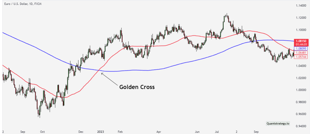
A Golden Cross signal is generated when the shorter-term 50-day SMA crosses above the longer-term 200-day SMA. This indication is regarded as a bullish signal because it suggests that the shorter-term trend has picked up momentum and outpaced the longer-term trend. Traders take this as a possible shift in market sentiment, implying that prices will rise more shortly.
So, the gold cross pattern is a bullish chart pattern, which suggests the beginning of a bull market. However, as with any other chart pattern, it is subject to failure and should be regarded totally at face value. As a result, it is best to keep sentiments out of trading.
Moreover, the Golden Cross is considered a “holy grail” chart pattern by many investors. They regard it as one of the most definitive signs of a bull market, and thus a strong buy indication. However, some technical analysts challenge the Cross pattern’s veracity. They do so due to the restricted investigation to detail and to demonstrate its reliability as a trading tool. The latest assessment opportunity is in support of the Golden Cross. Since the last time the pattern appeared in the S&P 500 Index, the index has increased by more than 50%.
What is a Death Cross?
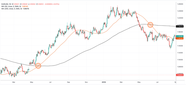
We should mention the Death Cross while discussing the Golden Cross. It’s the inverse signal that reveals a bearish trend is in operation as it shows that the shorter-term trend is weakening and can continue to drop. The Death Cross occurs whenever a shorter-period (50-day) moving average falls below the longer-term (200-day) moving average. A Death Cross can be utilized as an exit point in techniques based on the Golden Cross signal, and this idea works in reverse.
Three Stages of Golden Cross
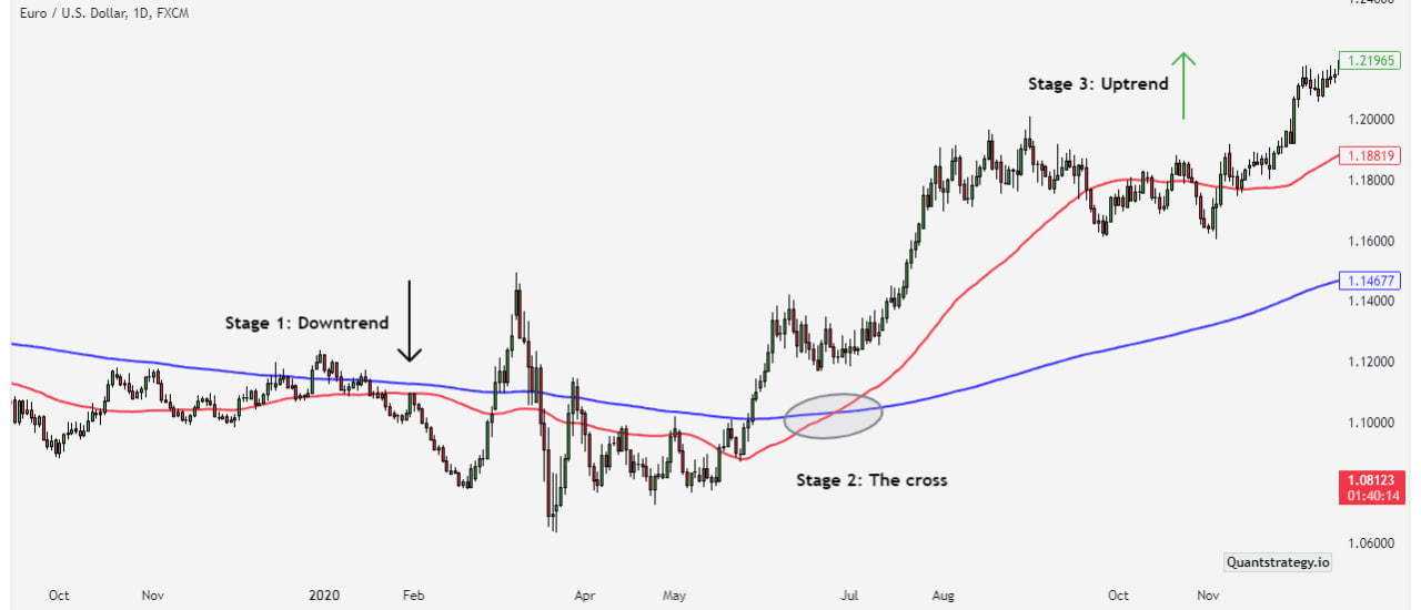
The Golden Cross pattern forms in three stages.
-
The first stage is characterized by a stagnant downward trend in which strong buying interest outnumbers selling interest.
-
The chart then levels off in the second stage, with buyers forcing prices upward to gain control. The ensuing momentum progressively moves the 50-day moving average through the 200-day moving average, at the point they intersect.
-
The last phase comes as the 50-day moving average rises, validating the bull market and, in most cases, resulting in overbuying, albeit in brief bursts. When corrective negative pullbacks occur during this phase, the longer moving average should serve as a support level. As long as both the 50-day average and price remain over the 200-day average, the bull market stays intact.
How does a Golden Cross Form?
Two simple moving average lines, known as MA or SMA, are employed to find the golden cross pattern on the hourly chart and in longer time frames. They display the asset’s price over a specific period.
It’s critical not to mix up a simple moving average with an exponential moving average (EMA) because the EMA concentrates on the current price trend that has evolved, and it responds more strongly to recent prices.
The value of the short-term moving average is frequently 50, while the value of the long-term moving average is normally 200 in the chart. The period denotes the number of days, and the moving averages are used to measure the market noise, which is the price variations that have occurred in these days. When the short-term moving average is below the long-term moving average, it indicates that the short-term price movement is bearish in comparison to the long-term price movement.
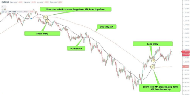
The pattern resembles a golden cross. A buy signal is when the 50-day moving average crosses the 200-day MA from the bottom up.
Watch for a golden cross indicator when a bearish trend is in place. The pattern can arise in any time frame, including short-term moving average crosses. The golden cross, on the other hand, indicates a more accurate buy signal in lengthier timeframes ranging from H4 to D1.
Since the Golden Cross is a lagging indicator, it is ineffective in intraday trading. Traders can use other indicators and candlestick patterns to confirm the pattern in the price chart.
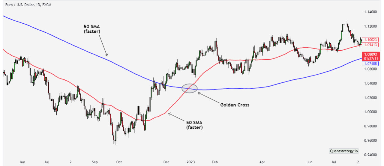
Trade Example – Golden Cross Signal
The $TSLA chart above is a typical example of a golden cross trading. The blue line on the chart represents the 50-period SMA, while the red line represents the 200-period SMA.
The chart starts with a strong downward trend in which the price action remains below the 50-period and 200-period MAs.
Suddenly, the trend changes to the positive, and the price begins to rise. Naturally, the 50-period SMA responds faster to price changes because it is more sensitive to recent price activity.
A golden cross appears when the 50-period moving average crosses the 200-period moving average to the upside. This is highlighted in the grey circle.
Golden Cross Trading Strategy
Trading is more realistic than having just theoretical knowledge. To get the most out of the golden cross, make sure to use it correctly.
But how do you use the Golden Cross?
First, you must confirm that the crossover occurs and that a candle closes over the crossover. After that, you should follow a trading strategy that includes an acceptable stop loss and take profit level.
The golden cross pattern may assist in determining when to enter a long position or leave a short one, as it signifies the culmination of the bear market. There are numerous ways to employ golden cross trading strategies. Three of them are examined below:
Basic Golden Cross Strategy
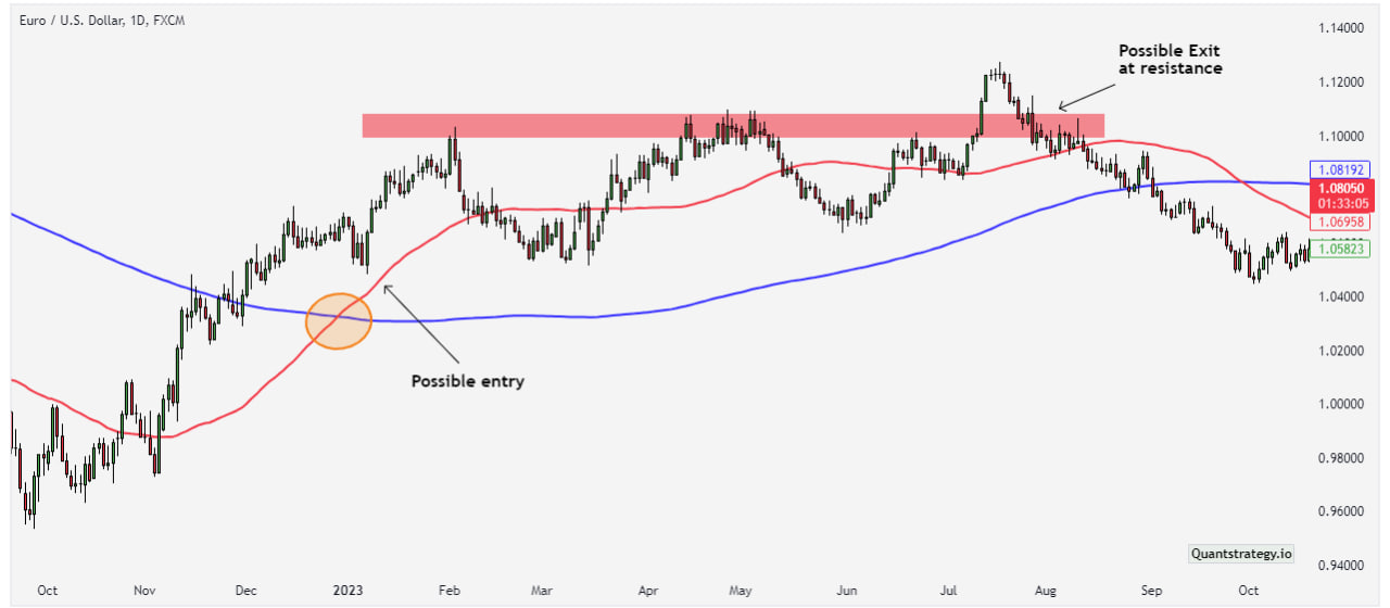
This trading strategy involves finding a crossing of MAs corresponding to the price movement. This has to be the most fundamental rendition of a golden cross, which traders employ to enter long trades.
Here is how this trading strategy works:
A trader monitors MA pairs of their interest and enters or buys when they cross. Conservative traders seek retracement as confirmation before executing entry orders as a common risk management method. This is frequently an effective method of reducing losses.
Entry
-
Determine the precise location of the golden cross. Consider placing the purchase order once the price crosses the crossover area.
Exit
-
Finding the region to exit for a simple crossover without the help of other indicators can be difficult. If you are a cautious trader, you might set a stop loss below the 200-day SMA line.
-
In addition, if you see the 50-day EMA crossing below the 200-day SMA or the death cross, the first intersection can be an excellent moment to exit. A sharp price decline or a falling knife becomes the expected outcome in a death cross.
-
If you understand how candlestick patterns work, search for bearish candlestick reversal patterns such as three black crows, evening star, or more. Locating a bearish reversal pattern might assist you in locating the required profit-booking cues even if the 50-day EMA remains above the 200-day SMA.
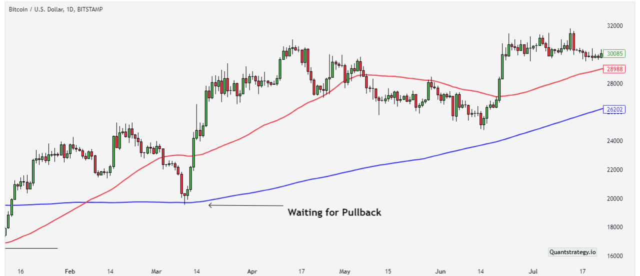
The Pullback Strategy
This golden cross strategy is far more reliable than the conventional use of a golden cross. Here’s how it works:
When a golden cross occurs, do not instantly jump on the price breakout. Instead, wait for the price to return or retrace near the crossover area. The purpose of this type of pullback is to wash out all the weak links before the uptrend starts. The pullback technique assumes that prices would retrace to specific support levels before continuing to rise.
Consider using the following strategy:
Entry
-
Determine the exact location of the crossing. When the price reaches that region, expect a pullback — the price will return to the 50-day EMA and subsequently the 200-day SMA as key support levels.
-
You can consider opening a trading position only if the price goes back up after reaching the support levels.
Exit
-
While you can always leave once a death cross is spotted, there are a few more things to keep in mind.
-
As soon as you see a pullback, set your stop loss level lower than the ideal pullback level – lower than the 50-EMA and the 200-SMA.
-
If you are familiar with how to draw support levels, attempt to find the ones that coincide with the 50-day EMA and the 200-day SMA.
-
If the price first breaks the support and then proceeds to violate the moving average lines, you can change your stop loss or exit position accordingly.
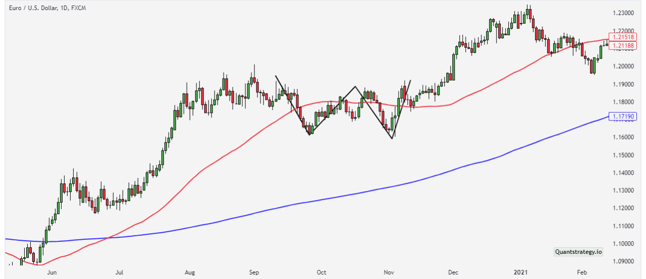
Golden Cross with Double Bottom Pattern
After discussing two trading strategies using the golden cross, the next strategy is combining the golden cross with the double bottom pattern.
The double bottom pattern denotes a trend change and a momentum reversal from prior price movement. It is a zone where the price produces two equal lows (to the support level, that is, long-term MA), forming the letter “W” on a chart.
The pattern typically follows a big or minor downtrend, indicating a reversal and the start of a future uptrend. It implies that sellers attempted to lower the price, following which bulls turned active to drive the price higher again.
The double bottom, like other chart patterns, is most appropriate for studying an intermediate to the longer-term outlook of the market to obtain profitable trading recommendations. As a result, traders can discover daily, weekly, or monthly price data charts for this pattern more beneficial.
The chart below depicts the end of a downtrend as the 50 EMA crosses above the 200 SMA. The upward movement is then confirmed by a double bottom. Remember that the price has to drop below the 50 EMA while remaining above the 200 SMA (the support level).
Advantages and Disadvantages of Using Golden Cross
Like several other patterns and indicators in technical analysis, Golden Cross has many advantages and disadvantages. Let’s have a look.
Advantages
-
The pattern is useful in trading all types of financial markets.
-
It can validate a trend reversal.
-
It applies to any timeframe but is most effective in h4 and longer timeframes.
-
It helps in finding possible entry points.
-
It can be employed on its own or together with other indicators.
-
It is relatively easy to find and analyze in the price chart.
Disadvantages
-
It produces false signals in shorter timeframes because of market noise.
-
It is based on MAs, which being lagging indicators provide a delayed buy signal to the trader.
-
It should always be confirmed with other chart patterns and technical indicators before trading.
-
The most precise indications are produced only in longer timeframes and in high trading volumes.
-
It is poor at anticipating trend reversals rather than verifying those already occurring.
Conclusion
To summarize, a golden cross is a moving average-based bullish reversal pattern.
A golden cross happens when a short-term moving average, generally the 50-day, crosses above its long-term moving average, generally the 200-day. It indicates a bearish-to-bullish trend reversal and a purchase entry point.
Although the Golden Cross is a powerful signal, it isn’t completely helpful at forecasting trend reversals. Therefore, it should be utilized with other technical indicators and patterns to ensure its authenticity and accuracy.