In the ever-evolving landscape of financial markets, traders and investors constantly seek tools that provide clear insights into price movements. One such tool that has stood the test of time is the Point and Figure chart.
In this article, we will delve into the intricacies of Point and Figure charts, exploring their history, how they work, and strategies for effective trading.
History of Point and Figure Charts
The origin of Point and Figure charts can be traced back to the late 19th century, with their development closely tied to the pioneering work of Charles Dow, the co-founder of Dow Jones & Company. During this period, financial markets were evolving rapidly, and traders sought effective methods to visualize and analyze price movements in basically bar charts.
Charles Dow, a prominent figure in the world of finance and the creator of the Dow Jones Industrial Average recognized the need for a tool that could filter out the noise inherent in daily price fluctuations. Inspired by the simplicity of capturing essential market movements, Dow introduced what we now know as Point and Figure charts.
The early applications of Point and Figure charts were not just limited to Dow. Other influential figures of that era, including William Peter Hamilton, a Wall Street Journal editor, and Robert Rhea, a financial analyst, contributed significantly to refining and popularizing this unique charting method, unlike bar charts.
During its nascent stages, Point and Figure charts found favor among technical analysts and traders who valued a straightforward yet effective way to interpret market trends. The method gained further traction in the early 20th century as its utility became evident in identifying significant price changes without being swayed by short-term market fluctuations.
Understanding P&F Chart Basics
These charts, unlike traditional candlestick or line charts, offer a unique visual representation of price movements, emphasizing significant changes while filtering out the day-to-day noise.
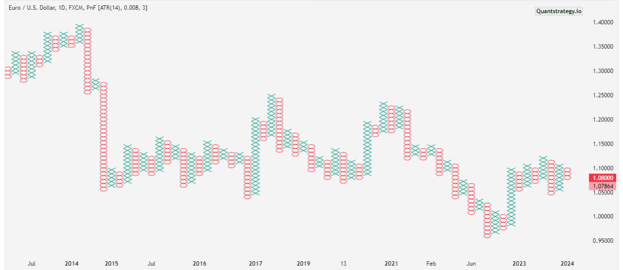
Point and Figure charts are built on a grid where each column represents a specific price movement. The chart takes the form of a series of Xs and Os, with Xs denoting upward price movements and Os representing downward movements. The construction starts by identifying a chosen box size and reversal amount. The “Current Column” is a dynamic representation, illustrating the most recent price changes.
The Xs and Os play a pivotal role in conveying market information. An X is marked when prices rise by the box size, indicating strength in the upward movement. Conversely, an O is used when prices fall by the same magnitude, signaling a downward trend. At least one unit is required for a new X or O to be plotted. The arrangement of these symbols in columns creates a visual narrative of the market’s ebb and flow.
P&F chart focuses solely on significant price movements, ignoring the element of time. This unique characteristic aids in identifying prevailing trends more clearly. A series of consecutive Xs or Os in a column signifies a sustained price level trend, allowing traders to discern the overall market direction with greater precision.
By emphasizing key price changes and eliminating the distraction of minor fluctuations, Point and Figure charts simplify the complex task of understanding market trends. Traders can easily identify the strength of price trends, potential reversals, and crucial support and resistance levels, making these charts a powerful tool in the trader’s arsenal.
Advantages of Point and Figure Charts
Traders appreciate P&F charts for their simplicity and clarity. The charts filter out minor price movements, allowing traders to focus on substantial trends. This eliminates the noise that often clouds traditional candlestick or line charts, providing a more unambiguous view of market direction.
The charts prioritize significant price movements, disregarding the element of time. This unique feature enables traders to identify and focus on trends that truly matter. Whether it’s a prolonged uptrend or a significant reversal, P&F charts provide a visual representation that emphasizes the critical movements driving market dynamics.
Incorporating P&F charts into one’s analytical toolkit can significantly enhance the quality of decision-making. Their straightforward nature, coupled with the ability to eliminate extraneous details, makes them a valuable resource for traders seeking a clear and unambiguous perspective on market trends.
The term “predefined table” typically refers to a structured table or set of predetermined values, parameters, or conditions that are established in advance for specific purposes.
How to Read Point and Figure Charts
Reading P&F charts involves deciphering the visual cues created by Xs and Os to understand market trends and identify potential entry and exit points.
While these charts may seem unconventional at first, their simplicity holds the key to effective analysis. Here’s a step-by-step guide on how to read P&F charts:
- Understanding Xs and Os:
- Xs represent rising prices, indicating upward movements.
- Os represent falling prices, signaling a downward trend.
- Columns of Xs and Os are formed based on price movements.
- Box Size and Reversal Amount:
- Determine the box size and reversal method before analyzing the chart.
- The box size represents the minimum price change required to plot an X or O.
- Reversal amount indicates the number of boxes needed to reverse the current trend.
If there are fewer X’s in a column, it indicates a lesser number of consecutive upward price changes.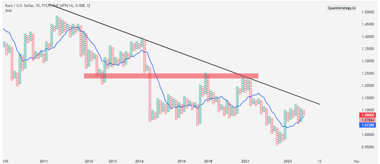
- Identifying Trends:
- A column of consecutive Xs signifies an uptrend.
- A column of consecutive Os indicates a downtrend.
- The absence of Xs or Os suggests a consolidation or sideways movement.
- Recognizing Buy and Sell Signals:
- Buy signals occur when a new column of Xs surpasses the previous column’s high.
- Sell signals occur when a new column of Os falls below the previous column’s low.
- Patterns and Formations:
- Various patterns emerge, such as double tops, double bottoms, and trendlines.
- Recognizing these patterns helps predict potential trend reversals or continuations.
- Support and Resistance Levels:
- Horizontal counts formed by consecutive Xs or Os help identify support and resistance levels.
- These levels play a crucial role in making informed trading decisions.
Setting Up P&F Charts for Trading
Effective use of P&F charts requires customization based on individual preferences. Choosing the right box size and reversal amount is crucial. Traders should also consider timeframes and scaling options to align the chart with their trading goals.
Customization based on trading style, integration of additional indicators, and adjustments for market volatility contribute to tailoring the charts effectively.
Experimentation with different combinations and consistent review and adaptation to changing market conditions are essential.
Utilizing annotations on charts aids in tracking decisions, while the incorporation of trendlines and pattern identification provides additional insights.
What is Box Scaling?
Box scaling refers to the predetermined price increment determining when a new X or O is plotted on the chart. It plays a significant role in adjusting the sensitivity of the chart to price movements.
In P&F charts, each X or O represents a specific price movement, and the size of this movement is determined by the box size. The price range box size is essentially the minimum price change required for a new X or O to be added to the chart. Traders can choose the box size based on their trading preferences and the level of granularity they seek in their analysis.
For example, if a stock is currently trading at $50, and the chosen box size is $1, a new X would be added when the price increases to $51. If the price then falls to $49, a new O would be added. This predetermined box size allows traders to filter out minor price fluctuations and focus on more significant movements.
Box scaling is closely related to the volatility of the asset being analyzed. In periods of high volatility, a smaller box size might be preferred to capture rapid price changes. On the other hand, during low volatility periods, a larger box size can help filter out noise and highlight more meaningful trend developments.
Filtered Price Movements are adjusted to focus on significant changes, eliminating noise by applying criteria like box sizes in P&F charts.
Strategies for Trading with Point and Figure Charts
Effectively navigating the complexities of trading with Point and Figure charts involves employing a range of strategic approaches. Embracing trend-following strategies enables traders to capitalize on the strength and direction of existing trends, guiding long or short positions based on the columns of Xs or Os.
Recognizing reversal patterns, such as double tops or bottoms, provides valuable signals for potential trend shifts, prompting adjustments in trading positions. Integration with other technical indicators, such as moving averages or Relative Strength Index, enhances the precision of Point and Figure analysis, strengthening overall trading strategies.
By identifying resistance/ support levels within the chart, traders can make informed decisions about entry and exit points, while adapting strategies based on market volatility ensures agility in response to changing conditions.
Monitoring trendlines, setting clear entry and exit points, and periodically reviewing and adapting strategies contribute to a dynamic and well-informed trading approach.
Common Mistakes to Avoid in Point and Figure Chart Trading
Avoiding common mistakes is pivotal in successfully navigating P&F chart trading.
Misinterpreting signals, neglecting broader market context, and overlooking risk management are crucial errors to circumvent.
Overtrading based on patterns, ignoring trend confirmation from other indicators, and a failure to adapt to changing market conditions can lead to suboptimal outcomes.
Relying solely on Point and Figure charts and lacking continuous learning also pose risks. Traders must adopt a holistic approach, integrating Point and Figure analysis with diverse tools and staying adaptable to market dynamics.
Adapting to Market Conditions
Adapting to market conditions is a critical aspect of successful trading, and this principle holds true when employing Point and Figure charts.
Market conditions are dynamic, and traders must adapt their strategies accordingly. Point and Figure charts prove versatile in different market trends, offering valuable insights during both bullish and bearish periods.
Tips for Beginners in P&F Chart Trading
For beginners, starting with simple patterns is key.
Gradual progression to more complex strategies ensures a solid understanding of Point and Figure chart analysis.
Continuous learning and analysis contribute to long-term success in trading.
Integration with Fundamental Analysis
While P&F charts primarily belong to the realm of technical analysis, integrating them with fundamental analysis can provide traders with a more comprehensive understanding of market dynamics.
Fundamental analysis involves assessing a financial instrument’s intrinsic value by examining economic, financial, and other qualitative factors. When coupled with P&F charts, this integration creates a well-rounded approach to decision-making.
One way to achieve synergy between Point and Figure analysis and fundamental factors is by considering key economic indicators. Traders can correlate major economic releases, such as GDP growth, employment data, and interest rate changes, with patterns identified in P&F charts. Understanding how these fundamental factors impact market sentiment can refine trading strategies.
Future Trends in P&F Chart Analysis
As technology continues to advance, P&F chart analysis is likely to witness further innovation. Integration with artificial intelligence and machine learning may open new avenues for more accurate predictions and trend identification.
Conclusion
In conclusion, P&F charts offer traders a unique and effective tool for analyzing market trends. Their simplicity, coupled with the ability to filter out noise, makes them valuable in decision-making. As you embark on your trading journey, consider incorporating P&F chart analysis to enhance your understanding and improve your trading strategies.
FAQs
Can P&F charts be used for short-term trading?
Yes, P&F charts can be adapted for short-term trading by adjusting box sizes and reversal amounts. It is preferred mostly by swing traders.
Are P&F charts suitable for all types of financial instruments?
P&F charts are versatile and can be applied to various financial instruments, including stock prices, forex, and commodities.
How often should I update my P&F charts?
The frequency of updates depends on your trading style, but regular monitoring is recommended, especially in fast-moving markets.